REVIEW: Superman’s Pal Jimmy Olsen #5
Superman’s Pal Jimmy Olsen #5 is here and this series just really catches you off-guard, in fact every single issue has so far. Timmy Olsen is back ! or is it Jimmy? I cannot wait to see what mad cap cappers Jimmy gets himself into next.
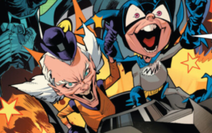
Well, the main cover for this issue created by interior artist Steve Lieber highlights exactly what kind of trouble Jimmy can get himself into when unsupervised. Straight off the bat, I simply adore this cover and love the use of the Batman ’66 TV show lyrics above the logo. This kind of acknowledgment really ties into the playful, quirky tone of the series. Seeing Jimmy drive the Batmobile is so much fun. This is a truly joyous cover, In my opinion the best of the series so far. Steve Lieber is the perfect artist for Jimmy Olsen, he effortlessly captures his full personality within each and every piece of art he does for this series.
The variant cover is created by Ben Oliver and depicts Jimmy doing his very best impression of The Batman atop a gargoyle. This cover is very creative and so unique to the artist. The comedy provided by the seagull landing on Jimmy’s head is just so subtle, yet really ties into the humour of the series. The addition of the blue sky creating the backdrop really creates connectivity tying into quintessential Superman iconography which I really loved and appreciated.

Superman’s Pal Jimmy Olsen #5 suprisingly enough is a rather Batman heavy issue, however not quite the Batman I’m used too. The issue, like it’s predecessors is broken up into bite size tales and opens up with the most irreverent of stories featuring none other than Bruce Wayne and his iconic alter ego The Batman.
Straight off the bat, I had to re-read these pages more than once to truly appreciate what was taking place. The Batman featured within these pages is a very unfamiliar take that I found difficult to get behind. In fact, at times I thought Batman’s dialogue sounded a lot like Dave Bautista’s version of Drax featured in The Guardians of the Galaxy movie franchise. For instance, Batman being concerned about what others think of him regarding his sense of humor is a hard concept to get behind, However this theme marries up perfectly to the overall tone of this series to date. Very quirky, very silver age in my opinion.
Even though these stories aren’t for me, the art and in particular the colours are totally on point. Colourist Nathan Fairbairn and artist Steve Lieber really do complement each others work. Where certain panels lack detail, Nathan Fairbairn’s colours really do step in and fill the scene with a real sense of depth and atmosphere. The use of the ’89 Batmobile is a gorgeous touch that I really appreciated. I instantly had that iconic Danny Elfman score playing in my mind.
The issue moves forward with three remaining chapters that really pays off for me, due to the fact that they revolve around The Olsen family tree. This includes the debut of Jimmy’s sister Janie who just so happens to be an absolute delight and highlight of the whole issue. One tale in particular does a wonderful job of circling back to previous events and promises to shed light on the story as it develops.
I absolutely adored the section of the issue that rolled the clock back and chronicled the continuing exploits of The Olsen’s and Luthor’s throughout history, in this case the year 1888. This segment of the issue is beautifully illustrated, and captured with authenticity very much in mind as the decor and clothing is totally on point. These debuting ancestors are very engaging and I cannot wait to see what happens next with these star crossed lovers.
This issue is very much a game of two halves. For me, Superman’s pal Jimmy Olsen #5 started off a little too off beat for me however, as the issue progressed the story became much more coherent and really tied into previous events. Reading this issue, you can really tell that writer Matt Fraction is thoroughly enjoying himself on this series and it really does show. From the characters dialogue to the text setting the scene for each chapter, there seems to be a real sense of freedom and personality behind the writing.
The shackles really seem to be cast aside during the creation of this project as the audience is offered a true authentic vision from the creative team totally unfettered by higher ups. This is a very rare occurrence and I am enjoying every bonkers moment of it. I for one cannot wait to see what this creative team have in store next.
Haven’t picked up your issue yet? You can pick up the standard cover by Steve Lieber here (UK), or here (US).