REVIEW: Superman #16
The latest installment of Superman is here, and it felt like a much-needed break from all of the action and craziness that has been going on within that series and other linked ones.
This cover by Ivan Reis perfectly captures the contents and feel to the book. I love it. It’s bold, bright, and tonnes of fun. Although it is a shame that Reis’ artwork isn’t carried out throughout the book. To me, this cover is full of joy and that is clear on the facial expressions of the characters. The facial expressions are perfectly done as Damien still refuses to break his moody character.
![Superman #16 [Preview]](https://mlpnk72yciwc.i.optimole.com/w:600/h:911/q:auto/https://www.bleedingcool.com/wp-content/uploads/2019/10/scaled.sm-cv16.jpg)
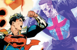
The variant cover by Jason Masters brings us a DCEASED theme. My god, this cover is perfect. An infected Superman ready to throw the iconic Daily Planet emblem at fellow co-workers. I love the idea of it, throughout the whole Superman mythos, the Daily Planet adore Superman and have him in such high regard. This artwork completely overturns that. I also love that Lois Lane (unlike anyone else featured in the cover) is about to take a picture, rather than run away – that’s our Lois! The golden hue as the reflection is a great idea and is really effective. This cover is perfect, and I wouldn’t change a thing!

Like I said before, this issue took a step towards the light-heartedness of the characters and their situation. Although there wasn’t too much action that was significant within the series, I really enjoyed this issue. It focused around relationships, and I think we (as readers) just needed this issue to understand and take in what has been happening in the universe.
When series’ play around with time-travel, and with such huge events happening – Jon now being much older and being asked to join The Legion Of Superheroes – this felt very much like a catch up issue for the readers. It allowed us to marry up exactly how much Jon had grown, and what point of the timeline we were on. Like I said, I felt that it was much needed as the issues before this seemed rather isolated to me – brilliant, but isolated and unrelated.
The relationships and dynamics between the characters in this issue were perfect for me. Admittedly I haven’t read too much of the Super Sons, but that will certainly change now. I loved their relationship and the way that they interact with each other. It certainly brought out several laughs from me. It’s a typical teenage friendship and it’s nice to see that represented in comic form.
Damien very much wants to be the coolest out of the pair, but even though Jon is now older and taller than him (which he isn’t happy about) you can see that he is genuinely happy to see his best friend again. Not only that but you can see how happy he is for Jon and the support he has for him is incredible. My favourite part of their exchange was the whole “I don’t hug” section, it was just so heartfelt, and I think he really made Jon feel at ease and come to terms with the huge decision he was about to make.
This issue was beautifully written. For those that read ‘Lois Lane’, that last issue very much covered Lois’s goodbye to her son, whereas this one showcased Superman’s. Superman has understandably been reluctant to let his son go into the future after he just got him back from space, and that has shown within the pages of the previous issues. This issue shows how proud he is of his son, and the dynamic between the two is beautiful – they have such a loving relationship and a mutual respect for each other. Although Superman doesn’t want his son to leave, he knows that The Legion need him, so he has no other choice but to take on the mission.
What I did love about this aspect was how emotionally vulnerable Superman was. It’s sometimes rare to see that side to him, and it’s easy to forget that he can feel that way with the immense power he has. It was nice to see the support and trust between him and a member of The Legion, I feel it was mostly her words and her gift that eased this loving father into letting his son travel so far away from him.
The artwork within the book was bold and striking, however it felt a little out of place in comparison to the other issues. It would have been nice for it to flow slightly with that, although I understand that this was a different artist. Don’t get me wrong, the artwork was great, but the art by David Lafuente in this issue seemed a little cartoony and it actually reminded me of the Fisher Price designs. This is due to the bodies and poses of the characters – Superman in particular – he was just ever so slightly out of proportion. With that said, I think Lafuente would provide us with incredible artwork for a Super Sons spin off, but like I said it felt out of place compared to the other issues – perhaps that’s what they were getting at?
We are about to see Jon take on the biggest responsibility of his life, and I cannot wait to see what happens next. Haven’t picked up your copy yet? You can get the standard cover by Ivan Reis here (UK), or here (US). Or if like me you prefer the variant cover by Jason Masters, you can pick that up here.