REVIEW: Superman: Red & Blue #3
Superman: Red & Blue #3 is another fine collection of stories that really showcase the best of Superman. I truly love how creative and unique some of these stories are, but that’s the beauty of a series like this, it really allows creative teams the freedom to truly showcase their take on such an iconic character.
Superman: Red & Blue #3 continues and each time I see this series appear on this weeks release list, I have a smile on my face. I’ve really enjoyed the series so far and I absolutely love seeing so many different takes on my favourite character.
But before we get into the issue itself, let’s take a look at the covers. The standard cover is by A Paul Rope and I absolutely adore it! I really love the use of colours here considering they’re limited, the way that Rope has shaded with the two different colours is very clever. This feels like a very theatrical and cartoonistic Superman and I love that. The design instantly feels like a classic piece rather than a modern take on the character, it’s magnificent.
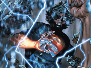
The first variant cover is by John Paul Leon and is a very bittersweet piece. This cover is truly magnificent and really showcases some of Leon’s best work in my opinion. It’s bold, vibrant and holds incredible detail, especially in the landscape behind the Man Of Steel. It’s safe to say this cover hits very differently since hearing about his passing, and what a wonderful final piece this is.
The final variant is by Derrick Chew and is a true sight to behold. This piece truly looks godly as the light shines through the Metropolis skyline and shines just behind Superman. Despite the limited colours, this is a very realistic piece and has some elements to it that really reminds me of Alex Ross’ artwork and that is a huge compliment. Superman looks confident and heroic here and I adore the way his cape is flowing in the wind.

Superman: Red & Blue #3 sports another wave of mini stories from a plethora of creative teams using only the colours red and blue. Just to reiterate what I’ve said every time this issue releases, I love the idea of this and also the creative freedom that this concept gives the creative teams behind it. So far we have had some excellent stories and ideas. Again, this issue consists of five stories, so I’ll break the reviews down in the same way for ease.
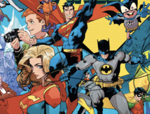
The first story is titled “Deadline” and is written by Jesse J Holland, with art by Laura Braga and colours by Hi-Fi. Clark Kent is cutting a deadline very fine at The Daily Planet and is almost late to lunch with his friends, Bruce and Diana. Time is of the essence and he is running out of it, but can he stick to his appointments on time? This story really made me smile, not only did it really showcase many of Superman and Clark’s best qualities, but it really put some perspective to them as well. I love how Holland honed in on where Superman got these mannerisms from and really highlighted the differences in technique when it comes to Batman and Wonder Woman. I really loved this story and I loved how it addressed something that I’ve been thinking for years. A lot of people (mostly villains) use lead against Superman and tend to enclose things in lead so that Superman can’t see… but that isn’t the case. In fact it would actually make it easier for him to find because he can see through everything BUT that object, and this is one of the first times I’ve seen that acknowledged.
The artwork in this story by Laura Braga was sensational, I really like her take on Clark and Superman, though I have to say Perry did look a little strange to me. I really loved the montages of him saving people and stopping to take selfies with people, that is what Superman is all about and the art does an excellent job of showing the determination on his face and the joy that it brings him. The colours really add to that too, and Hi-Fi does an excellent job of breaking up the pages despite only using two colours. Not only that but his colours really show the warmth and radiance of people, which allows their feelings to be spread out across the pages.
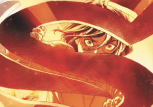
The second story is titled “Kilg%re City” (yes, that is the title, there is no typo here) and is written and illustrated by Michel Fiffe. Superman and some members of The Justice League take on a number of threats, during that time they each have heart to hearts with one another which really showcase the respect and relationship that they have for each other. It’s all about teamwork and the importance of nurturing that. For me it wasn’t the best story out of the bunch, but I did enjoy several ideals within it. Those moments really made this story for me and not only worked well in the context of the story, but work well as genuine life advice.
In this story I really love how Fiffe has used the colours to highlight the main character, Superman. Everything else is colourless and it really allows us to focus our attention on the Man Of Steel and his actions. I will say that the artwork is very cartoonistic and is something that I’d expect to see in a graphic novel or comic aimed towards a younger audience, but that’s not to say I didn’t like it. In fact I loved it in the context of this story and I feel that it really suited the tone of it.
The third story is “A Man Most Saved” and is written by Brandon Thomas, with art by Berat Pekmezci. I have to say this was one of my favourites in this issue. The story focuses around a man named Charley Miles, who is giving his account to Cat Grant on how many times he’s been saved by Superman. The tables then turned as he found himself saving Superman. This story focuses around the message of everything happening for a reason and I really loved that concept to it. I love the little details to this story, such as Superman taking the time out of his day to go to lunch with Charley and the fact that they now have a bit of a relationship because of their connection. It isn’t just us that need Superman, he needs us too.
Another thing I loved about this story is the fact that it paid tribute to so many different eras of Superman, that was so great to see not only because of the nostalgic value, but also because it shows them to be in the same universe. Now, I’m not sure if that was down to the artist of the writer, but I really appreciated it. Speaking of the artist, Pekmezci did a wonderful job with bringing this story to life. I have to say out the the stories in this issue and despite the lack of colours he was able to use, this is the art that feels most authentic and realistic, and that really adds to the pay off of this story.
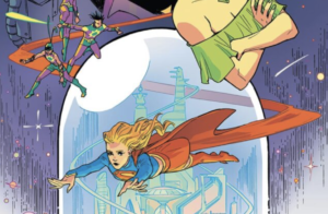
The fourth story is titled “Something To Hold On To” and is written by Nick Spencer with art by Christian Ward. This was a really sweet and wholesome story, where Superman opened up his Fortress Of Solitude to a children’s home, when one of their toys turned out to be an invention by Toyman. What I loved about this story is that Superman put these children who had similar beginnings as he did, in the forefront and gave them a day they’ll never forget. I really enjoyed seeing all of the little gadgets and activities that Superman had put on for these children, that took great imagination. Not only that but he gave up something that meant a great deal to him in order to make one of the children happy. I just thought this whole concept and story was really sweet and showed us just how much heart Superman really has.
The artwork in this story is great too, and perfectly matches the tone of the issue. Ward does an excellent job of showing the feelings of the characters through facial expressions. Whilst the detail and colour is minimal in some places, it really allows you to focus on the aspects that the writer wants you to focus in on.
The fifth and final story is titled “Little Star” and is written and illustrated by James Stokoe. Superman heads into space to tackle a meteor as it falls towards Earth, as he gets closer he sees that it isn’t a meteor at all, but is instead a creature of some sort. I love how Superman sympathised with something so alien and so terrifying to look at, rather than judging it based on the way it looks. Instead of launching an attack as many others would do, he takes the time to truly understand what the creature wants and decides to help it on its way. This was a really great story, which really showcased another thing I love about Superman, his compassion.
I will say that the artwork in this story is my least favourite from the issue. It just feels bulky, out of proportion and out of place when compared to the other stories. I will say that Stokoe really draws space well, the detail on the satellites, creatures and surrounding atmosphere are great, but when it comes to Superman, that style just doesn’t work for me.
Superman: Red & Blue #3 is another fine collection of stories that really showcase the best of Superman. I truly love how creative and unique some of these stories are, but that’s the beauty of a series like this, it really allows creative teams the freedom to truly showcase their take on such an iconic character.
Haven’t picked up Superman: Red & Blue #3 yet? You can get the standard cover by A Paul Rope here. Or if you prefer the variant cover by John Paul Leon, you can get that here.
**The above links are affiliates, which mean I will earn commission from any products bought via these links**


