REVIEW: Superman: Red & Blue #6
Superman: Red & Blue #6 is another excellent collection of stories featuring Superman and his supporting characters. The creative teams behind these stories clearly fully understand Superman and all he stands for and I love seeing the numerous takes on my favourite character.
Superman: Red & Blue #6 is finally here and I cannot express how much I have loved this anthology series so far. Each week the stories get better and better and it is clear that these creative teams really care for and know the ins and outs of Superman.
But before we get into the issue itself, let’s take a look at the covers. The standard cover is by Evan “Doc” Shaner and it is absolutely phenomenal. It’s as if the reader is being enticed by Superman to go on a flight with him, as if the reader is one of them and I adore that. I also love the HUGE plethora of iterations of Superman also featured on the cover, every time you look at a different area you notice a new character. I’ve spent far more time than I care to admit looking at this cover and I do not regret a single moment of it.

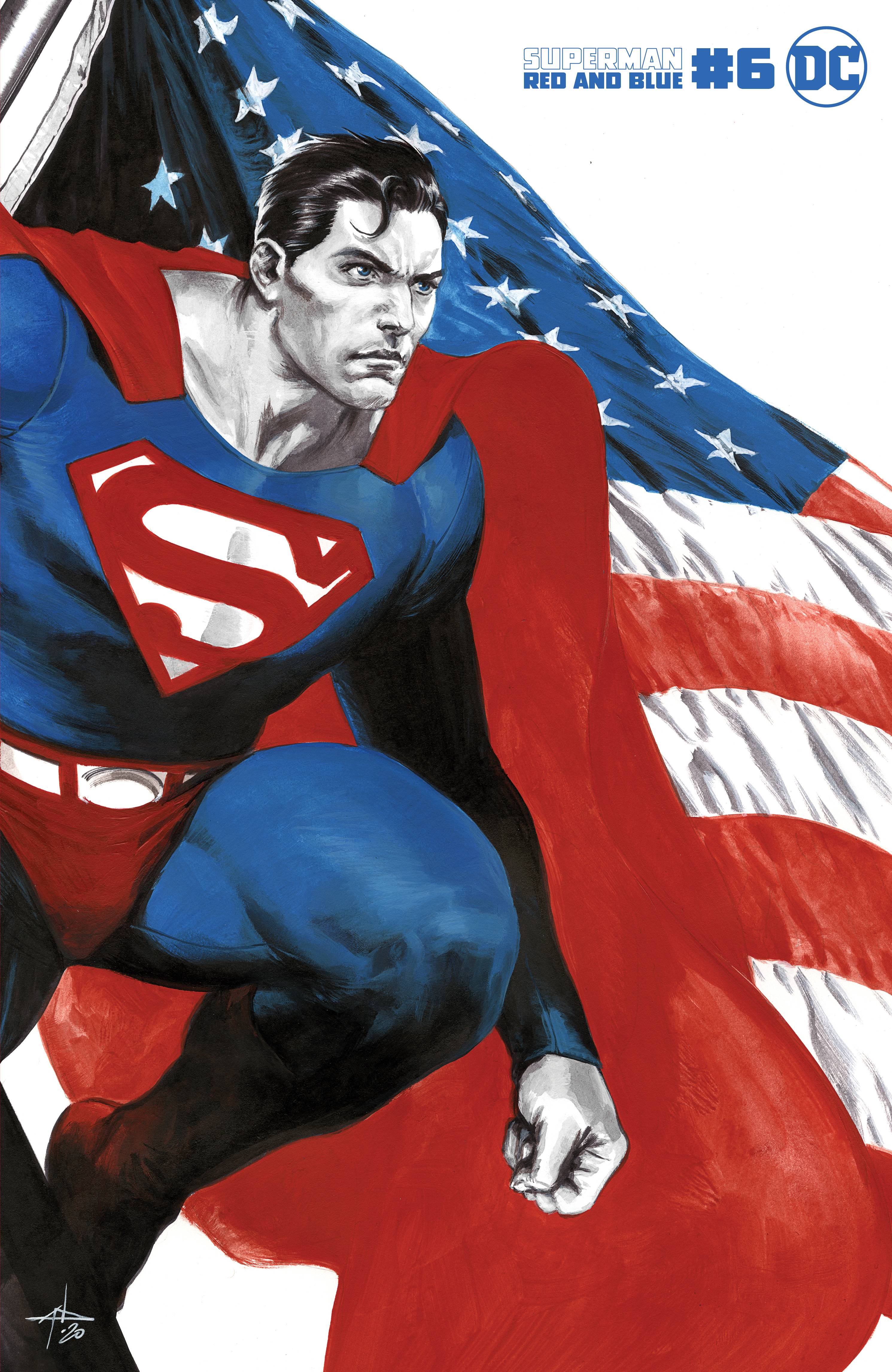
The first variant cover is by Gabrielle Dell’Otto and it is absolutely spectacular. I love the patriotism in it, and I love that this piece instantly gives me Christopher Reeve vibes. The detail is epic, from the way the flag falls to the creases in Superman’s suit, no detail is spared and that is synonymous with Dell’Otto. I’m a big fan of his work and this piece just reminds me why.
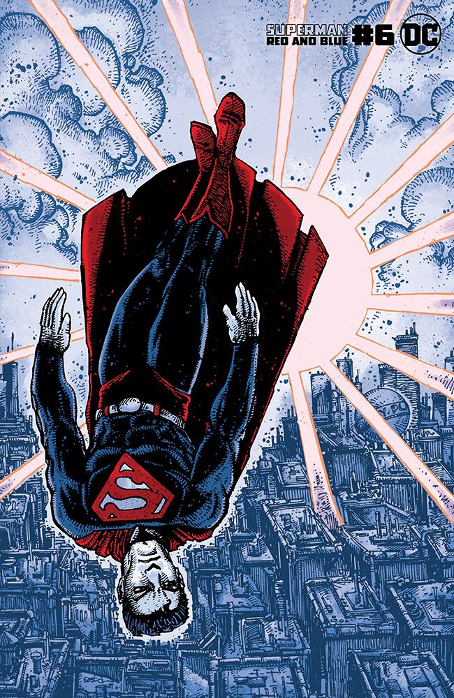
The second variant cover is by Kevin Eastman and Dave Stewart, which showcases Superman floating above the Metropolis skyline. Despite the fact that Superman is on the cover, my favourite aspect of this piece is the background, I love the rough lines used on the buildings and the way the sun beams down on each and every building. Though Superman is full of detail created with those same rough lines, which is excellent, I do feel that he is placed rather awkwardly and that takes the emphasis away from this piece, which is shame.
Superman: Red & Blue #6 features five brand new stories from a range of creative teams, which I’ll review individually as per previous issues.
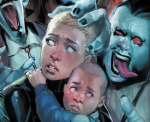
The first story is titled “Hissy Fit” and is written and illustrated by Sophie Cambell. While I am not usually a fan of the Super Pets myself, I will say I enjoyed this story very much, and for several reasons. Firstly, the colouring choices and secondly, the dialogue choices really make this story stand out, in that there ARE NONE. This story is silent, and the only colours we get are the colours of the line art, which are mostly blue, but then change to red in certain hectic moments for certain characters, which is really effective. It’s clean, bold, and I love it. The art is so expressive and tells the story perfectly, without the need for anything being said. The line art itself is fantastic, rendering the characters and environments in perfect comic-booky detail.
The story itself is a fun premise I don’t know if we’ve ever seen before, and that is, it’s moving day for Superman and Supergirl, they are packing up the Fortress of Solitude to apparently move it from the North Pole to the South Pole. The depiction of this is hilarious, with the two of them literally packing up the bottled city of Kandor into a cardboard box, with “Kandor” written in sharpie on the outside. Things go awry however, when they attempt to put Streaky into his pet crate, sending the super feline on a panicked rampage, during which, he literally sheers a cargo ship in half.
Honestly, this is why the Super Pets would never be a thing. Even if they did exist, the world would never tolerate Superman keeping them on Earth because of incidents like this. Surely someone died, and now the shipping company have to pay for a ship to be repaired or replaced, because I doubt a spot weld by Superman and Supergirl will pass safety inspections. Streaky escapes and eventually just shows back up at the new fortress, where apparently all is forgiven. I’m not a cat person, I’m not a pet person, so the “lovable scamp” reaction baffles me. But whatever. One last thing I really enjoyed about this story, is that Supergirl is drawn sporting a new look, and I really like it! She’s rocking a ponytail, shorts, and a top with slightly shorter sleeves. Let’s see this in a mainstream comic please!
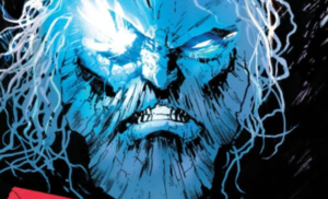
The second story is titled “The Scoop” and is written by Matt Wagner and art by Brennan Wagner, which features what appears to be an in-canon continuation of the world of the Fleischer Superman series of the 1940’s! These cartoons are some of my all time favorite Superman media, and it was such a treat to see the world fleshed out more here. What’s great about this, is that it gives us a look inside the life and mind of Fleischer Clark Kent, as we see him writing articles explaining the backstory to many of the villains we see in the series, and being frustrated that his articles are taking a far backseat to Lois’ flashy front page articles about the exploits of Superman.
In this story we get deeper backstories for the episodes: Bulleteers, Billion Dollar Limited, Terror on the Midway, the Mechanical Monsters (my favorite episode), and “Superman,” or as it’s sometimes called, “The Mad Scientist.”
Finally, Clark takes solace in the fact that there’s a secret story only he can write, an expose on the origins of Superman. According to his inner monologue, he intends to release the story to the public sometime in the future, implying that when he does so, he’ll also reveal his secret identity. Perhaps he’s planning to retire at some point? This is a great story for the true Superman fan, adding detail and nuance to one of Superman’s oldest universes. I’m guessing this story takes place before the CW’s Crisis on Infinite Earths Tie-In comic, in which the Fleischer universe is destroyed by the Anti-monitor.
The artwork is great here too, though it doesn’t quite match up to the art featured in the Fleischer series, it is pretty damn close and I love how it has a real classic and iconic feel to it, specifically the last page of the story.
The third story is titled “The Special”, which is written by Tom King and illustrated by Paolo Rivera. This story was a masterwork. It has to be on my top 5 list for these Red and Blue stories. This is another story that uses the color restrictions in a unique and powerful way, and what’s more, actually ties in the color choices with the story. The story revolves around a diner waitress in Smallville named Annie, who has seen Clark Kent grow up from an infant to, now, a father. We get to see pivotal moments from Clark’s life, held right there in the diner. A moving conversation with Pa Kent, his break-up with Lana Lang, visiting for Christmas after first becoming Superman, prepping Lois for her first meeting with his parents, and more.
The art is beautiful. It’s classic comic book, but with a slightly softer feel which suits the story perfectly. There are some beautiful panels, one in particular being Superman and Lois kissing near The Daily Planet globe. This was my favourite story of the issue, I won’t spoil any more of it for you, but this is masterfully done.
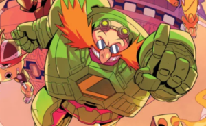
The fourth story is titled “Son of Farmers” and is written by Darcie Little Badger (which is an awesome name), with art by Steve Pugh. And Steve, I just want to say, Bravo. The art is amazing. The use of red and blue in the hot pink and turquoise range is really unique and makes the whole story look like a foil trading card. We get some peeks at amazing moments in Superman’s life, including a scene taken straight out of “Livewire” from Superman: The Animated Series (albeit with a slight costume adjustment). The renderings are beautiful, and now I want to see Steve Pugh working on a Superman title regularly. The story itself has a poignant message, perfect for Superman, and great ammo to throw at the “Superman is overpowered” argument. This was really well done, and really hit home for me.
The fifth and final story is titled “Ally” and is written by Rex Ogle, with art by Mike Norton. I loved this story, it really hones in on comparing yourselves to others, and when it’s Superman there’s a lot to live up to! I really loved how the writer took Superman’s truth and used it to inspire others into telling their own truths. In this case it was a young man coming out to his family as gay, and I love that Rex Ogle did this. Superman is for everyone, and this is a perfect example of that and also how he can inspire a vast array of people in a a range of situations. Not just to do better, but also to be truthful to themselves and being the best version of yourself you can be.
The artwork in this story is excellent, using red and blue only for moments where Superman is featured and using no colour to represent the main character in this story. Not only does this really allow them to stand out for different reasons, but it’s just so striking, your eyes are instantly drawn to the character that the artist wants you to focus on. Though I will argue that this story does break the colour scheme of red and blue at the end of the story, but I understand why it has been done and it works.
Superman: Red & Blue #6 is another excellent collection of stories featuring Superman and his supporting characters. The creative teams behind these stories clearly fully understand Superman and all he stands for and I love seeing the numerous takes on my favourite character.
Haven’t picked up Superman: Red & Blue #6 yet? You can get the standard cover by Evan “Doc” Shaner here (UK), or here (US).
**The above links are affiliates, which mean I will earn commission from any products bought via these links**