REVIEW: Superman’s Pal Jimmy Olsen #3
Superman’s Pal Jimmy Olsen #3 is here with arguably one of the most offbeat covers I have ever seen.
I feel as though I have been staring at this cover for what seems like hours now trying to deciding whether I like it or not. Honestly the jury is still out on that one, however I will say that this cover totally marries up to the unpredictable nature of the series and that is something I like to see.
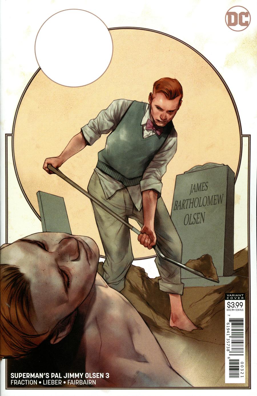
The variant cover by Ben Oliver is a highly realistic piece of art that replaces the irreverent and lighthearted tone of the regular cover – a rather grim portrait of a man digging a grave essentially for himself. This is a very contemplative cover that is extremely melancholy in tone. Ben Oliver’s artwork always makes me think, and this cover is no exception. Highly thought provoking indeed.
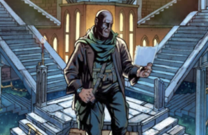
This issue certainly follows in the footsteps of previous issues. Especially regarding tone and structure with short and sweet chapters chronicling the adventures of Jimmy Olsen. The first two segments of this issue are by far my favourite. Like previous issues, the continuing exploits of Joachim Olsson and the other residents of New Oberstad take centre stage. This is a very intriguing period of time with fascinating characters and events that will help shape the future of Metropolis. I find myself eagerly anticipating the progression of this story each month. I love to see how the feud between Joachim Olsson and Luthais Alexander intensifies. I’m sure the ramifications of this feud will no doubt reverberate throughout the remainder of the series, and hopeful play a pivotal role in the events occurring in the present day.
This is in fact subtly evident in the next section of the issue as none other than Lex Luthor comes into possession of a ‘time capsule’ courtesy of the destruction that befell the Monarch of Metropolis . This whole sequence is fascinating as it ties into past events that occurred during the era of New Oberstad. The incident involving the monarch felt very integral at the beginning of the series, and for me its great to see that event further explored and to see it evolve into part of a mystery that connects different era’s within this very series.
In fact there are a number of sequences and information featured that really begins to tie back into previous issues which I found highly rewarding. Some information definitely feels as though it is being relayed out of sequence, but that actually really works for me considering the way each issue has been structured so far. Even Matt Fraction’s inner monologue if you will highlights the non-linear approach the storytelling has taken in this issue.
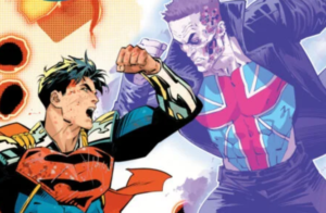
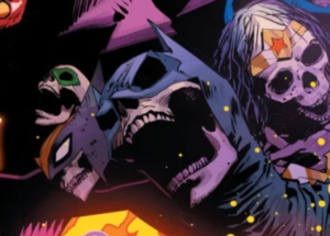
As the issue progresses the stories seemingly become more ‘offbeat’ and ‘wacky’, however with a second viewing it becomes evident that there is a deliberate thread occurring, as Jimmy and known associates of his are falling victim to acts of foul play way to frequent to be that of a coincidence. I love the quirky style these events are depicted in. Its all very wacky and goofy, very silver age in my opinion. These scenes for me highlight perfectly the vision of the creative team. The issue comes to a close with Jimmy alongside Lois set for a collision course with one of the most powerful men in Metropolis. I cannot wait to see this confrontation play out.
I really feel that Matt Fraction’s writing in this issue is a lot more straight forward than previous issues. There seems to be less whimsy and more direction regarding where our characters need to be. We certainly seem to be well on our way regarding Jimmy’s investigation that we saw take root at the end of the last issue. I really like how this issue started to fill in some of the gaps. Originally I was unsure of what exactly transpired when Jimmy transformed into a Giant Turtle, however this issue went a long way to shed new light on that situation, which I am grateful for. I really hope future issues follow suit regarding events that take place.
The artwork in this issue provided by Steve Lieber is gorgeous. Every page is full of wonderful detail that makes each environment feel just so rich. I particularly love how Lieber works with colourist Nathan Fairbairn. The pair seem to have an incredible understanding as the colours featured in this issue add to the storytelling right alongside the art and writing. The ‘Teal’ coloured skies really are beautiful in this issue, and add real depth to the scenes.
Overall Superman’s Pal Jimmy Olsen #3 is a really entertaining read. It adds real connective tissue to events that occurred in previous issues. You can really start to see an overarching narrative developing across the series, and indeed through the ages regarding the events of New Oberstad. As always Superman’s Pal Jimmy Olsen is a visual delight as the artwork and colours pop off every page. The colour choices made by Nathan Fairbairn are exquisite and feel each page with depth and texture. I really am excited to get my hands on the next issue.
Haven’t picked up your issue of Superman’s Pal Jimmy Olsen #3 yet? You can pick up the standard issue by Steve Lieber here (UK) or here (US). Or if you want to get your hands on the variant cover by Ben Oliver, you can get your copy here.