REVIEW: Superman: Red & Blue #1
Superman: Red & Blue #1 is a fine collection of stories that really showcases why we love Superman and also highlights some of his best traits. With impeccable writing and a fantastically unique artwork concept, this anthology series is an instant classic that I highly recommend.
Superman: Red & Blue #1 sees the start of a brand new six issue anthology series, which showcases a collection of stories featuring our favourite hero in his iconic red and blue colours. Since it’s announcement it sounded like a very unique and creative project and I have been looking forward to diving into it.
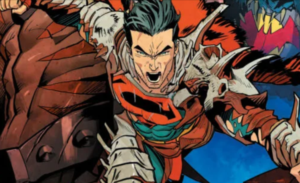
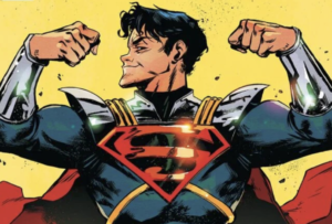
But before we get into the issue itself, lets take a look at the covers. The standard cover is by Gary Frank and Brad Anderson and I adore it. It’s just so bold and I think that will be a recurring theme when it comes to these covers and also the contents of the issues. The detail is in the areas it’s needed, from Superman’s suit, the city of Metropolis, to the line work on the clouds, this is incredible. My only critique is that I would liked to see the outlines of his trunks and boots, as they feel a little drowned out by his bright red cape.

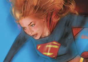
The first variant cover is by Lee Bermejo, who I am a huge fan of. He is known for his incredibly detailed and realistic take on our favourite characters, and this piece is no exception. The detail is just phenomenal and the black and white background and skin tones really allow the red and blue coloured suit to pop right off the page. I also love the red and blue streaking to show the direction and speed it took to get to this stance. Perfection.

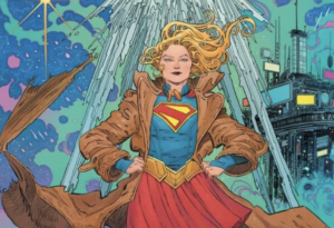
The second variant cover is by Yoshitaka Amano and it instantly catches your eye. I admit I was not really familiar with this artists work or style prior to this piece, but it’s safe to say he has a very distinctive style that from now on will be instantly recognisable. I love how he has incorporated the American flag into the piece and I adore that you can instantly tell which tools has been used to create the piece. In some parts you can even still see the pencil sketching and I have to say I really like that, it adds a really raw feel to the piece.

Usually I’d review Superman: Red & Blue #1 as a whole, but due to this being a collection of stories within one issue, I wanted to address each story individually, hence the slightly unusual format!
First up is ‘Untitled‘, which is written by John Ridley, with art by Clayton Henry and colours by Jordie Bellaire. Superman faces the only man that has ever made him feel vulnerable and powerless, as he heads to Lubania to do a high profile interview with one of its wealthiest men. This story highlights one of my favourite things about Superman, his generosity when it comes to giving second changes. This man has done unspeakable things to Superman and countless others, and Superman has the ability to seek his revenge upon him in a number of ways, yet he chooses not to. I love how writer John Ridley showcases what’s going on in Clark’s mind, as we see a glimpse at what he’d love to do to him, but he knows that isn’t right. It’s something that all of us would feel or think, and I think that makes him so relatable in this story.
The artwork is fantastic too, it’s incredibly bold and finely detailed. I’m a huge fan of Clayton Henry’s artwork anyway, and this is no exception. From the cityscapes to the facial expressions, we can instantly tell how a character is feeling and what is going on at any given moment. That artwork combined with the clever colours by Jordie Bellaire, really make this story stand out. I adore how the backgrounds are uncoloured and only the areas you need to focus on are in colour, it instantly draws you in to where you need to be, with no distractions.
The second story in this issue is titled ‘The Measure Of Hope‘, which is written by Brandon Easton, with art by Steve Lieber and colours by Ron Chan. Someone who admires Superman sends him a large number of letters for his help and guidance, but by the time Superman gets to read them it’s too late. This is such an unusual Superman story to read, firstly because it is so heavy and features themes that we wouldn’t usually expect to see in a Superman comic. Secondly, Superman saves this man by not really even being there. Those two things are why I love this story, it’s so refreshing to see real life problems in comics, especially those that you wouldn’t think Superman could even help with. It’s what he stands for, and how others view him that really plays a part in this story, and it just reinforces what this iconic character represents – hope.
The artwork by Steve Lieber in this story is phenomenal, it’s incredibly realistic yet cartoonistic at the same time and I feel it has a great balance considering the themes that are covered. The way that Ron Chan has coloured these pages are perfect, and really allows the characters facial expressions and compositions to shine through.
The third story within the issue is titled ‘The Boy Who Saved Superman‘ and is written and illustrated by Wes Craig. Superman is struggling to face off against a monster in Metropolis and things aren’t looking good. Suddenly despite the odds and the environment, a stranger puts his faith in Superman to restore his power after not wanting to face the same fate twice. This story really put a smile on my face, it is beautiful. Firstly I love how a boy is the one to save Superman and not the other way around, but I feel the story as a whole is so rewarding. These two have so much more in common than meets the eye, and it really adds a connection between the pair. This is as heartwarming as a Superman story gets, I adored it.
The artwork is great too, there’s detail where required and blank space where it isn’t, its very clever. It’s also rather simplistic, but it really works, especially in the moments taking place in The Daily Planet. I’ve said this regarding every story so far, but the way the colours are used is incredibly clever and unique. I love how Wes Craig uses the blue in calmer situations and red when there’s danger, it really adds to the stakes of this story.
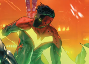
The fourth story in this issue is titled ‘Human Colors‘, which is written by Dan Watters and illustrated by Dani. The world is visited by an Imp from the Fifth Dimension (no, it isn’t Mr Mxyzptlk) who drains it of it’s colour and even the Earth’s inhabitants cannot remember what colour is. Feeling bad about the theft, the Imp returns the colours to Superman in a box and gives him the decision of releasing them back into the world. I really liked this story, compared the some of the others in this issue it seemed rather simplistic and lightweight, but that is not a bad thing at all. Sometimes the simple stories are the best and it perfectly showcased the burden that Superman sometimes has when it comes to making decisions as big as these.
In terms of artwork, which is by Dani, this story really stands out as it’s the only one to not use the red and blue colour scheme throughout. The artwork is excellent, unique and perfectly fits the story and concept of it. I do love the use of the inking and there are moments that benefit from the ink running which is mostly used in the cityscapes within the story. As for the pages that do incorporate those colours, they are gorgeous! I took a few minutes just starting at the final page of this story, it’s beautiful.
The fifth and final story within the issue is titled ‘The School Of Hard Knock-Knock Jokes‘, which is written by Marguerite Bennett, with illustrations by Jill Thompson. A young Clark Kent embarks on his first day of kindergarten and is nervous as to whether he can make friends or not. On his journey of his first day he sees someone playing alone and decides to take action. I loved this story, it was adorable. I love seeing a young Clark learn all of his sentiments and personality traits from his adopted parents, it really is what builds him up to be the man he is today and this story showed that perfectly.
The artwork, which is by Jill Thompson is beautiful, very realistic and it just feels timeless. It really reminds me of something you see in a children’s book, which I feel perfectly captures the essence of the story. I think Jill Thompson is the only person in the issue to really use different shades of the red and blue colours, which really makes this story all the more believable.
Superman: Red & Blue #1 is a fine collection of stories that really showcases why we love Superman and also highlights some of his best traits. With impeccable writing and a fantastically unique artwork concept, this anthology series is an instant classic that I highly recommend.
Haven’t picked up Superman: Red & Blue #1 yet? You can get the standard cover by Gary Frank and Brad Anderson here (UK), or here (US).
**The above links are affiliates, which mean I will earn commission from any products bought via these links**

2 thoughts on “REVIEW: Superman: Red & Blue #1”